Saturday, February 2, 2019
Staring into space
The halls are filled with people with blank faces; some hearing hats as some are covering their heads to cover the mess they made. Strangers are walking past one another, staring on their phones, distancing themselves from reality. I don't understand any of this.
Thursday, January 3, 2019
Sitting by myself..
In this world, there are more over 2 billion people that walk across the earth. Sometimes for best and some for the worst. There are more than blacks and whites that we surround ourselves with. More than the unthinkable and unimaginable. Sometimes there are people wishing the worst for you, sometimes there isn’t much to say in order to change their minds.you just watch them walk by you like you’re nothing. But there is more to that, there is more than what meets the eye. There is something deeper and remarkable that we encounter with people. There are people with no energy that I don’t feel, I just don’t understand what makes a person for who they are. There is this something in the air, yes, there must be something. When I find out, I will be able to tell my story.
Monday, December 24, 2018
Fresh Start...

I remember when I was a little girl, wishing I was old enough to do things in life. Truth be told, being old sucks. Sometimes I wish I can start over from the beginning and have a fresh start. But it's too late, there are a few more days until there is a new year and to be honest, I am not ready. Well, a part of me is because I'm finally a senior in college, but after college, I don't know where I see myself. Maybe traveling the world, or starting a family. Or maybe, Just maybe owning a business. Life is hard, but someone has to live it. I want to thank all my professors for being there for me when I needed them the most and overall, I want to thank my friends and family for encouraging me to keep moving forward. It's time to spread my wings and fly towards my career. At the end of the day, I am the creator of my own world and I am in control.
I can't wait for this new year and I'm ready for a fresh start, fresh beginnings, and fresh ends.
Wednesday, December 19, 2018
End of a Journey...
Phillip Sweet, once said “Stay true to yourself, yet always be open to learn. Work hard, and never give up on your dreams, even when nobody else believes they can come true but you. These are not cliches but real tools you need no matter what you do in life to stay focused on your path.” This class has taught me a lot not only about myself, but what I’m capable of. There are going to be bad days and some good, I have to determine which path I decide to take in order to reach my success. This year has been hectic, but there is always light shining at the end of the tunnel.
Phillip Sweet, once said “Stay true to yourself, yet always be open to learn. Work hard, and never give up on your dreams, even when nobody else believes they can come true but you. These are not cliches but real tools you need no matter what you do in life to stay focused on your path.” This class has taught me a lot not only about myself, but what I’m capable of. There are going to be bad days and some good, I have to determine which path I decide to take in order to reach my success. This year has been hectic, but there is always light shining at the end of the tunnel.

Final Resume; implemented with camera to show a hobby for photography and structure.
For the resume project, at first I didn’t know what I wanted to do with this project. My imagination wasn’t there, so as I was brainstorming; I knew I wanted something vintage. When I searched the web, I saw a camera that spotted my eyes. This project has a little bit of my personality, which recruiters would know I enjoy photography, I have many websites, and what skills I’ve learned throughout my college years.

Call-to-action flyer; promoting a rave in NYC, DJ's, and the safety precautions.
The call-to-action flyer was very difficult. When we had to switch our flyer for someone else’s, I knew it wasn’t going to be easy. I knew I wanted to add a little fun to the flyer, without overbearing the real meaning for it. It was really fun to do and it was definitely a “think outside the box,” design. It really got me out my comfort zone, but that’s what made the experience exciting.

Brochure for furniture Company (love the colors that this company implemented).
This project was pretty easy due to the video we had to follow. Some fonts I did not have, so I used a font that I thought was appropriate for this brochure. The colors in this brochure catches your attention and it’s really beautiful to look it.

Business Card showing future goals, career, and dreams.
The resume project was one my favorites due to the fact we needed to silhouette ourselves. It took a good amount of time and was really fun to do. I was really happy and proud of myself; that I was able to create such a professional business card for my future. I’m really excited to see how far it takes me.

Color and black and white logos for Company logo.
Created with Pantone colors 3593 C and Gray 3 C.
For the logo design, I had a different idea in my mind of what I wanted to do. At first, I wanted to incorporate a brain fading, but it was too much. I knew I wanted to have something spiritual and classy. So those were my ideas above.

Business card design for spiritual company incorporated with contact information and company logo.
For my final logo design, I drew a book in adobe Illustrator, which didn’t take me a long time to do then I made my design in to a book. It was really fun to do and a learning experience. The book shows growth and strength. The book shows that every chapter in our life tells a story; some may be better than others, but we write our own stories and we determine how it’s going to end. No matter what we do in life, we have to appreciate the little things because eventually they will turn into big exciting things that we have to conquer. Trying to figure out life is the hardest thing to do, but this company teaches you how to live life day by day; living in general is a beautiful thing. This was one of my favorite designs that I’ve done throughout the whole semester.
Wednesday, December 12, 2018
Z's Dreams
This company reflects on the inner healing and self-growth of an individual. Not only do we want to reflect on the soul, but we want to shine the light on nature and animals as well. It will also teach people about soul-searching. We want to uplift your spirit on health, kindness, and well-being. We want to search for the true meaning of life; because it is more than just living. This company teaches you to have more patience, compassion, and love. Also to pursue your divine purpose in life. The company is going to say Z’s Dreams indicating Z (As my first initial). Dreams, in general, have a deeper meaning than what they may represent.
My company wants to bring the inner truth alive and teach people about the true meaning of their life. Dreams, from a spiritual perspective, holds challenges and secrets within. The company is going to have Dream Catchers, Spiritual oils, spiritual books, spiritual bracelets, books, spiritual rocks, etc. My company wants to mainly focus on anyone and everyone who is spiritual, but no religious (ages 18 and up). Or anyone who wants to learn more about who they are.
The Pantone colors used are gray, purple, and white. The color gray because it’s neutral and sophisticated. Also goes for the color purple. But the color purple will also implement feminine and wisdom which my company will portray. And white because it represents new beginnings, which people will have with Z’s Dreams.
The graphics used to make this company are circles because it represents the circle of life and unity. Z’s Dreams will teach people that everything in life matters, no matter if it’s small or big. Everyone and everything has a purpose, so our company wants people to enjoy and experience their life; also how to accept everything that has happened in their life.
Logo Central
Logos are designs that symbolize something specific. This includes businesses, gift cards, posters, advertisements, or company signs. They are not only important, but they give a combination of text and visual imagery that makes it come alive. There is a purpose for them; some are powerful and some are not. It tells a story and there is much more meaning behind the logos. We need logos in order to identify who and what they want to implement. It's a form of art that gives viewers a good first impression for the company and/ or business.
One logo that is significant is apple logo. For that being, the apple logo wasn’t always an apple. At first, it was a man under an apple tree then throughout the years, the apple has changed into a silver or black logo. Through generations technology has changed, so has the apple. Steve Jobs did a good job doing that.

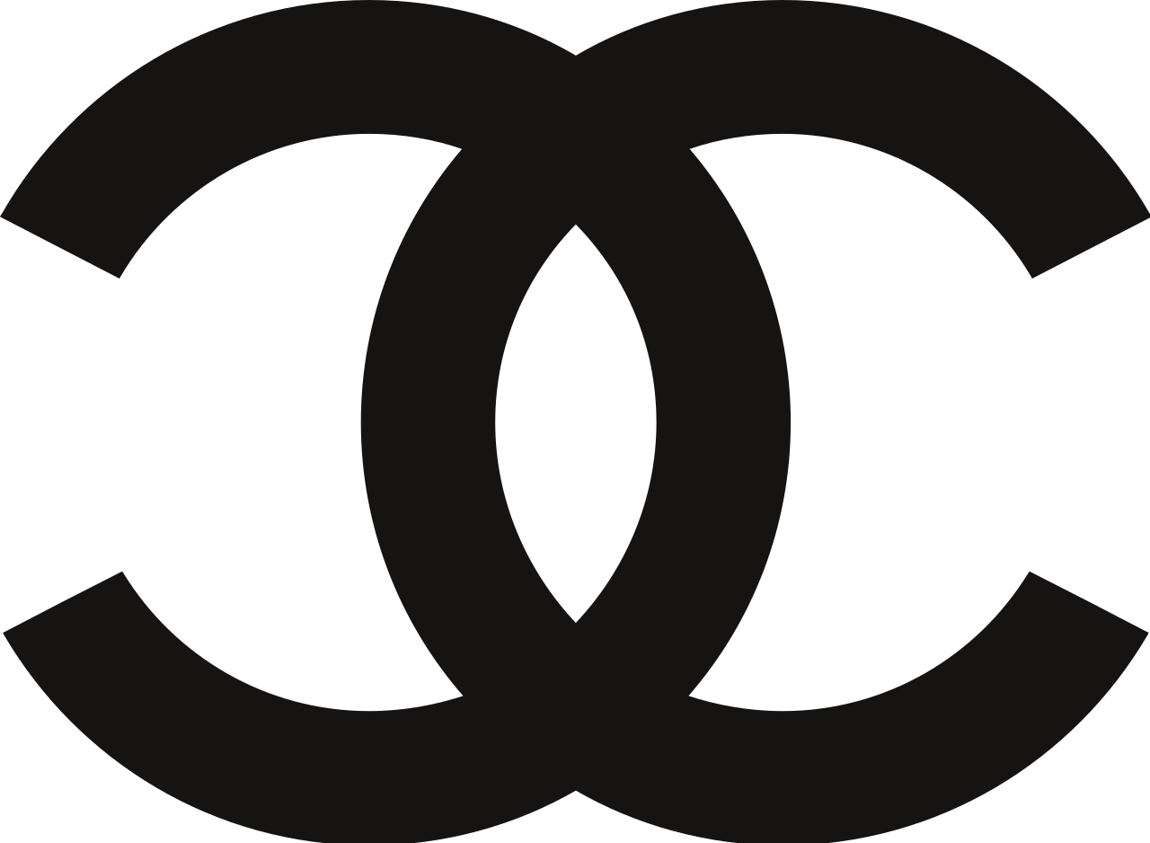
Another logo is the Coco-Chanel logo. For the Coco-Chanel logo, there's no denying that that Chanel logo is seen all around the world. The logo gives an identity to the brand and the face to the creator. They know who it is and it's more appealing to the eye. It relates to elegance, fashion, and classiness.
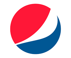
The pepsi logo is very strong like the apple logo. As well as the apple logo, the Pepsi logo isn't what it seemed to be. It looked different throughout the years; though it is red, white, and blue which indicates the USA flag, but also indicates unity and togetherness. It is the shape of a world which everyone could relate to; it’s a logo everyone should recognize.
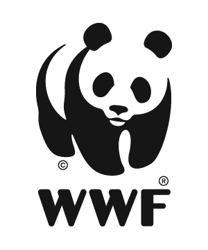
The WWF logo represents The World Wildlife Fund. The logo is a panda, which mainly focuses on endangered species and nature as well. It’s an optical illusion and it's well in the white space, which works perfectly for the cause. It provides the viewer with a vision of the image and they know what it is when they look at it. It’s creative and fun for everyone. It’s a great logo for a great cause!
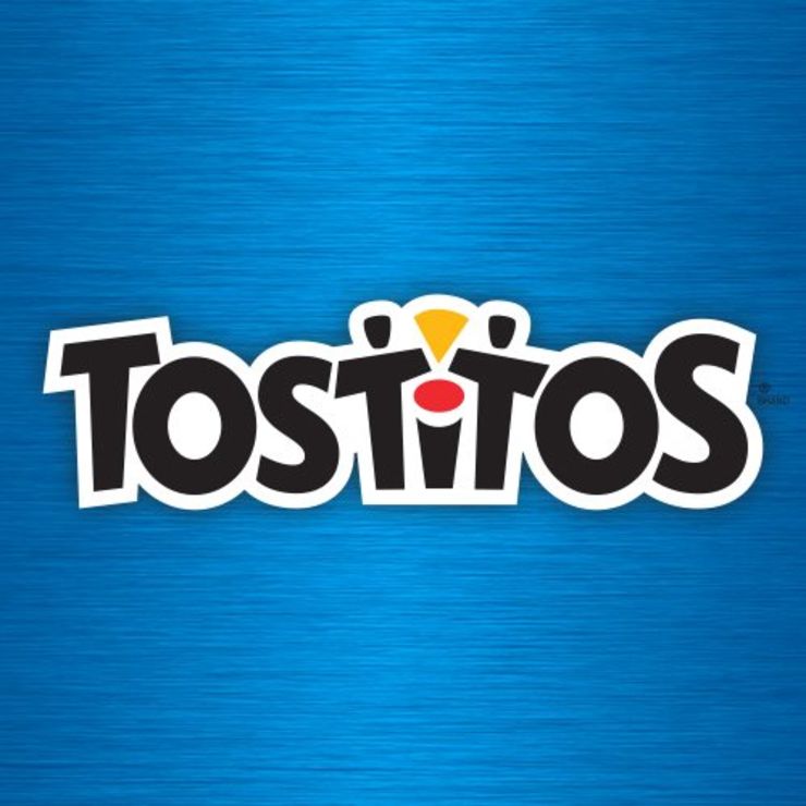
The logo below shows people dipping in the salsa in the middle. The logo Tostitos is very vibrant and it feels playful with the font used. It shows people connecting through chips and salsa. There’s definitely no party with chips! The blue shows friendliness and postivity,
Sunday, September 23, 2018
Between the Layers... there is more to the eye.
During our previous class, we discussed design principles and elements. Design principles and elements contribute uniqueness for images. Colors and shapes communicate to the audience and can be more effective in a design. The three images below are prime examples to identify strengths and weaknesses that peak one's attention. Both elements of design deliver a sort of message, but they are different in their own way.
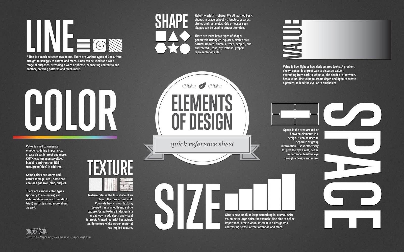
Mind Swirl

The approach of these images has many strengths; from the font to the colors. Everything about this is intriguing. First, the image on the left, allows viewers to look directly where the designers want them to look; which is at the S. The scheme of the image adds a visual element that pops off the image. The colors black and white traps space, but also allows space onto the image; which catches the viewer's eyes. They contrast off each other; which makes it easy to understand. The second image with the talented Emma Watson makes the image look for elegant and makes her stand out from the page. The portions that these images inquire borders certain areas and make the viewer focus on what is more important. From the top to bottom, from side to side, each element and column is consistent. Emma Watson has been very successful in her career, so having her as the image shows female success and independence. One way these images could improve is by re-centering Emma Watson so each of her shoulders could even with the borders of the image and making the S a little softer so it doesn’t look like the S is shouting at the reader. It could look more attractive by softening it a little bit, while still getting the reader's attention.
Stand up Straight
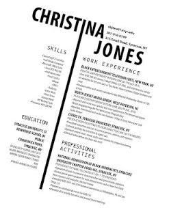
With this resume, Christina used two columns to separate information from left to right. On the left side, it says skills and education; on the right, it says work experience(s) and professional activities she is involved in. meanwhile, by her name, it states her email, phone number, and where she lives. Her resume appears readable to the viewers. Her name stands out overall and it creates a uniqueness most people might not have. The I that separates left and right peeks one's attention to notice how much effect and creativeness she has imported into her resume.
The elements are easy to read especially for employers. Her resume is consistent from top to bottom. The color scheme again from the previous images do not show a lot of white space, which allows the eyes to wander throughout the image towards what is important.
For that being said, if Christina re-centers her resume and doesn’t look like it is sideways. The viewers don’t have to tilt their heads and maybe it could be easy to read without moving your head sideways (back and forth).
All the images contain a lot of angles that help show various elements visually to the reader and/or viewer. While these aspects may seem organized, one might different and that’s okay. It's for the reader/viewer to determine what works and what doesn’t.
Subscribe to:
Comments (Atom)
-
Can you spell Visual Communication? Well, it does have an I in it and you have to Communicate, but does it have to always be visual? Can i...
-
In this world, there are more over 2 billion people that walk across the earth. Sometimes for best and some for the worst. There are more t...
-
The halls are filled with people with blank faces; some hearing hats as some are covering their heads to cover the mess they made. Strangers...
