Logos are designs that symbolize something specific. This includes businesses, gift cards, posters, advertisements, or company signs. They are not only important, but they give a combination of text and visual imagery that makes it come alive. There is a purpose for them; some are powerful and some are not. It tells a story and there is much more meaning behind the logos. We need logos in order to identify who and what they want to implement. It's a form of art that gives viewers a good first impression for the company and/ or business.
One logo that is significant is apple logo. For that being, the apple logo wasn’t always an apple. At first, it was a man under an apple tree then throughout the years, the apple has changed into a silver or black logo. Through generations technology has changed, so has the apple. Steve Jobs did a good job doing that.

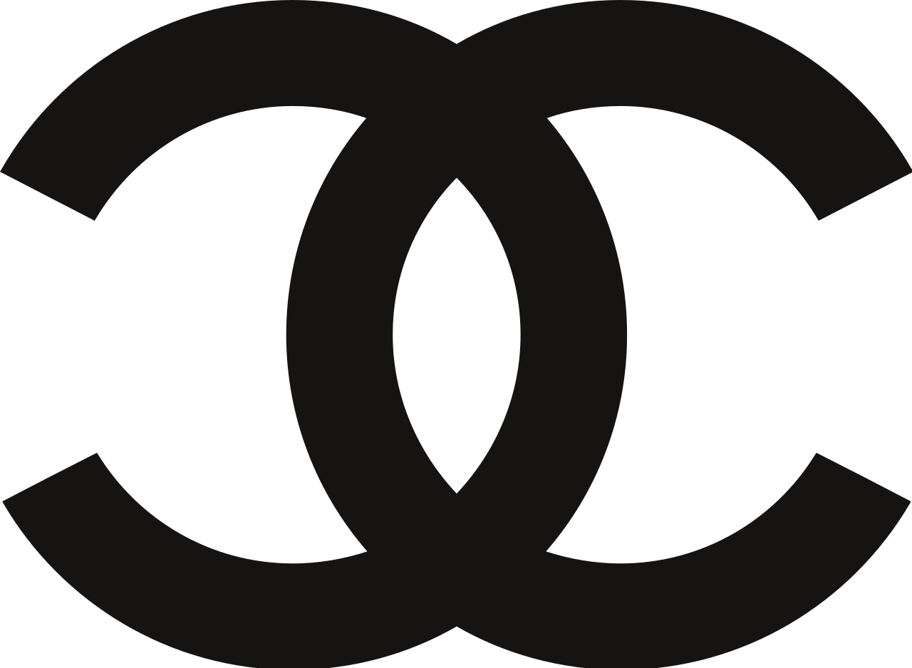
Another logo is the Coco-Chanel logo. For the Coco-Chanel logo, there's no denying that that Chanel logo is seen all around the world. The logo gives an identity to the brand and the face to the creator. They know who it is and it's more appealing to the eye. It relates to elegance, fashion, and classiness.
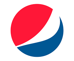
The pepsi logo is very strong like the apple logo. As well as the apple logo, the Pepsi logo isn't what it seemed to be. It looked different throughout the years; though it is red, white, and blue which indicates the USA flag, but also indicates unity and togetherness. It is the shape of a world which everyone could relate to; it’s a logo everyone should recognize.
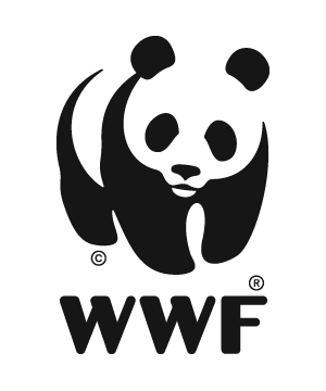
The WWF logo represents The World Wildlife Fund. The logo is a panda, which mainly focuses on endangered species and nature as well. It’s an optical illusion and it's well in the white space, which works perfectly for the cause. It provides the viewer with a vision of the image and they know what it is when they look at it. It’s creative and fun for everyone. It’s a great logo for a great cause!
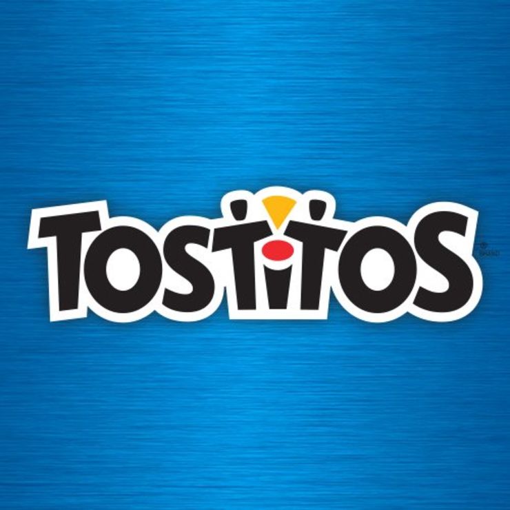
The logo below shows people dipping in the salsa in the middle. The logo Tostitos is very vibrant and it feels playful with the font used. It shows people connecting through chips and salsa. There’s definitely no party with chips! The blue shows friendliness and postivity,

No comments:
Post a Comment