Sunday, September 23, 2018

Between the Layers... there is more to the eye.

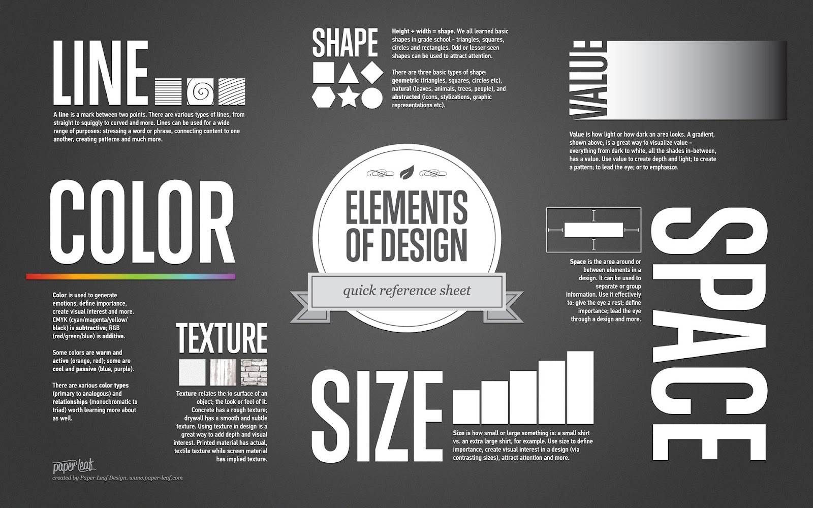
During our previous class, we discussed design principles and elements. Design principles and elements contribute uniqueness for images. Colors and shapes communicate to the audience and can be more effective in a design. The three images below are prime examples to identify strengths and weaknesses that peak one's attention. Both elements of design deliver a sort of message, but they are different in their own way.

Six Elements of Design Composition

Mind Swirl

The approach of these images has many strengths; from the font to the colors. Everything about this is intriguing. First, the image on the left, allows viewers to look directly where the designers want them to look; which is at the S. The scheme of the image adds a visual element that pops off the image. The colors black and white traps space, but also allows space onto the image; which catches the viewer's eyes. They contrast off each other; which makes it easy to understand. The second image with the talented Emma Watson makes the image look for elegant and makes her stand out from the page. The portions that these images inquire borders certain areas and make the viewer focus on what is more important. From the top to bottom, from side to side, each element and column is consistent. Emma Watson has been very successful in her career, so having her as the image shows female success and independence. One way these images could improve is by re-centering Emma Watson so each of her shoulders could even with the borders of the image and making the S a little softer so it doesn’t look like the S is shouting at the reader. It could look more attractive by softening it a little bit, while still getting the reader's attention.

Stand up Straight
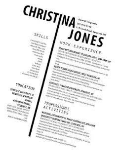
With this resume, Christina used two columns to separate information from left to right. On the left side, it says skills and education; on the right, it says work experience(s) and professional activities she is involved in. meanwhile, by her name, it states her email, phone number, and where she lives. Her resume appears readable to the viewers. Her name stands out overall and it creates a uniqueness most people might not have. The I that separates left and right peeks one's attention to notice how much effect and creativeness she has imported into her resume.

The elements are easy to read especially for employers. Her resume is consistent from top to bottom. The color scheme again from the previous images do not show a lot of white space, which allows the eyes to wander throughout the image towards what is important.

For that being said, if Christina re-centers her resume and doesn’t look like it is sideways. The viewers don’t have to tilt their heads and maybe it could be easy to read without moving your head sideways (back and forth).

All the images contain a lot of angles that help show various elements visually to the reader and/or viewer. While these aspects may seem organized, one might different and that’s okay. It's for the reader/viewer to determine what works and what doesn’t.


Sunday, September 9, 2018

How do you spell Visual Communication?

Can you spell Visual Communication? Well, it does have an I in it and you have to Communicate, but does it have to always be visual? Can it be verbal? How about audio or written? We as humans are taught at a very young age that everything around us is communicating even if we may not understand why. Visual Communication is the oldest communication since the cavemen and women. They used drawers to communicate with others; by drawing dinosaurs, making handprints, people, animals, and symbols. Knowing that Visual Communication has been around for years and years, we can come to an understanding that we rely on it more than anything else. Even Though they didn't have color back then; now in the 21-century color is significant because not only does it contain certain meanings and messages, but people can react to it differently and it can target certain emotions. We might have different communication styles, but we can all come to a conclusion that Visual Communication is always changing, but it is not going anywhere anytime soon.


The type of communication that most people might respond to is visual and verbal. The reason people might responds this way because it’s easier to acknowledge through everyday life. From being a baby to an adult, we have the ability to understand information more clearly and efficiently when we are able to visually see things. We are able to make a connection between words and images. Also, there are many students and people who take notes during lectures and/or meeting(es); so they are able to have the information for future purposes. That is really important.

The necessary most tool for Visual Communication is images. For that being said, images are more effective towards the audience(s). People can gain more knowledge/information by looking at graphics, photos, charts, art, and films. Images can target the five senses as well as grabbing attention to a certain cause or awareness. Also, images can help educate people and can tell a story. Through advertising, ads build sales and profits by reaching the right audience. Therefore, Visual Communication is all around us. Sometimes we may see an image different from someone else, but that is what makes Visual Communication creative and intriguing. Without Visual Communication, we wouldn’t be able to understand the effect it has.  Images in Visual Communication are easy to understand and people who are from different cultures can easily look at them; know what to do and/or where to go. There are images everywhere including stop signs, hospital signs, crosswalks, temperatures, road signs, designs, ads, airport signs, and etc.
Image result for visual verbal learner


One example of an effective brand is the Barbie brand. Yes, it may be pink and feminine, but it represents joy, self-confidence, and love. Pink is a powerful color, so for that being said, many people might have their own perspective towards colors and what it may mean. Barbies may statement is to show little girls that they can be anything they want to be by setting a dream and living to that. When little girls see the logo Barbie, smiles begin to widen on their faces and they are able to see the diversity it has impacted throughout the years.


barbie logo - Google Search


The second logo is the FedEx logo. That logo is powerful because if you look closely at the logo, you are able to see the arrow pointing and the color as well. each FedEx truck has a different color that may represent ground, services, express, freight, and chain networks. FedEx has been around for centuries, so their powerful visual message can communicate to people so they are able to understand what type of FedEx truck is driving down their street.


Another example is the PETA logo (brand). PETA stands for People for the Ethical Treatment of Animals. They are an animal rights organization that has been around since the 1980's. PETA educates people through protests and special events that help the cruelty of animals throughout the world. Their statement is based on cruelty-free products that people can buy that are not tested on animals. This logo has an emotional impact on people who are against animal cruelty and wants to make a difference.


Visual Communication is what makes us humans and we as humans are very complex.

Staring into space

The halls are filled with people with blank faces; some hearing hats as some are covering their heads to cover the mess they made. Strangers...